ShopDreamUp AI ArtDreamUp
Deviation Actions


Suggested Deviants


Suggested Collections


You Might Like…


Featured in Groups


Description
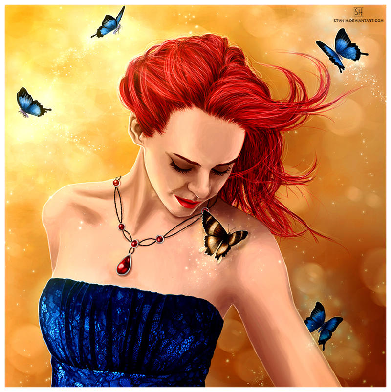
Date: 8th August 2012
Time: ca. 20 hours
Credits:
Model Reference - faestock fav.me/d51lcge
Butterfly References - Shoofly-Stock fav.me/d1ixoqy , ZergSTOCK fav.me/d4ypem
Lace Texture - own resources
Finally finished this picture today, and I can proudly say that I´m finally happy with something I did lately
I know this is very very very different from what I used to do and probably the cheesiest painting I ever did
I would be really happy about some comments and feedback, thank you in advance :3
Edit: okay I made an update again, I changed some parts like the shadow on her arm and the collarbone and neck tendon. Also I adjusted the saturation/contrast/colors again and added some lights and darks to her hair.
I hope you see the difference :3
Feel free to check out my new tumblr art blog: stvn-h.tumblr.com/
Thanks for the view and have a nice week!
Image size
820x823px 667.77 KB
© 2012 - 2024 stvn-h
Comments193
Join the community to add your comment. Already a deviant? Log In
OK so right off I agree with most of what was said in the other two critiques. The background is great and complements the whole piece very well. The butterflies are done well and the one brown one is a nice touch. The details in the dress are fantastic and the whole piece is surreal and very beautiful.
However, I think your shading needs a little work. The shading around the neck is too sharp and needs to be softened and the shading in the armpit area is too soft and needs to be sharper as there is a natural skin fold there.
I think the hair could have been done a little better. Don't get me wrong, the technique you used is good and I like the look of different strands but I think if you would have used varying shades of the red rather then black and white it would have given it more depth and looked more natural. Right now it just looks like she has red strands, black stands, and a few white strands which gives her an aged look. A good tip to follow when painting hair is that shadows and highlights don't appear on individual strands but rather whole sections. I always block out a solid darker color, then paint the strands on top of that, then add highlights with a soft brush.
Overall, besides these few things, I think this is a wonderful piece of work and like you said you should be proud of it. But you're only going to get better! I look forward to seeing what you do next.